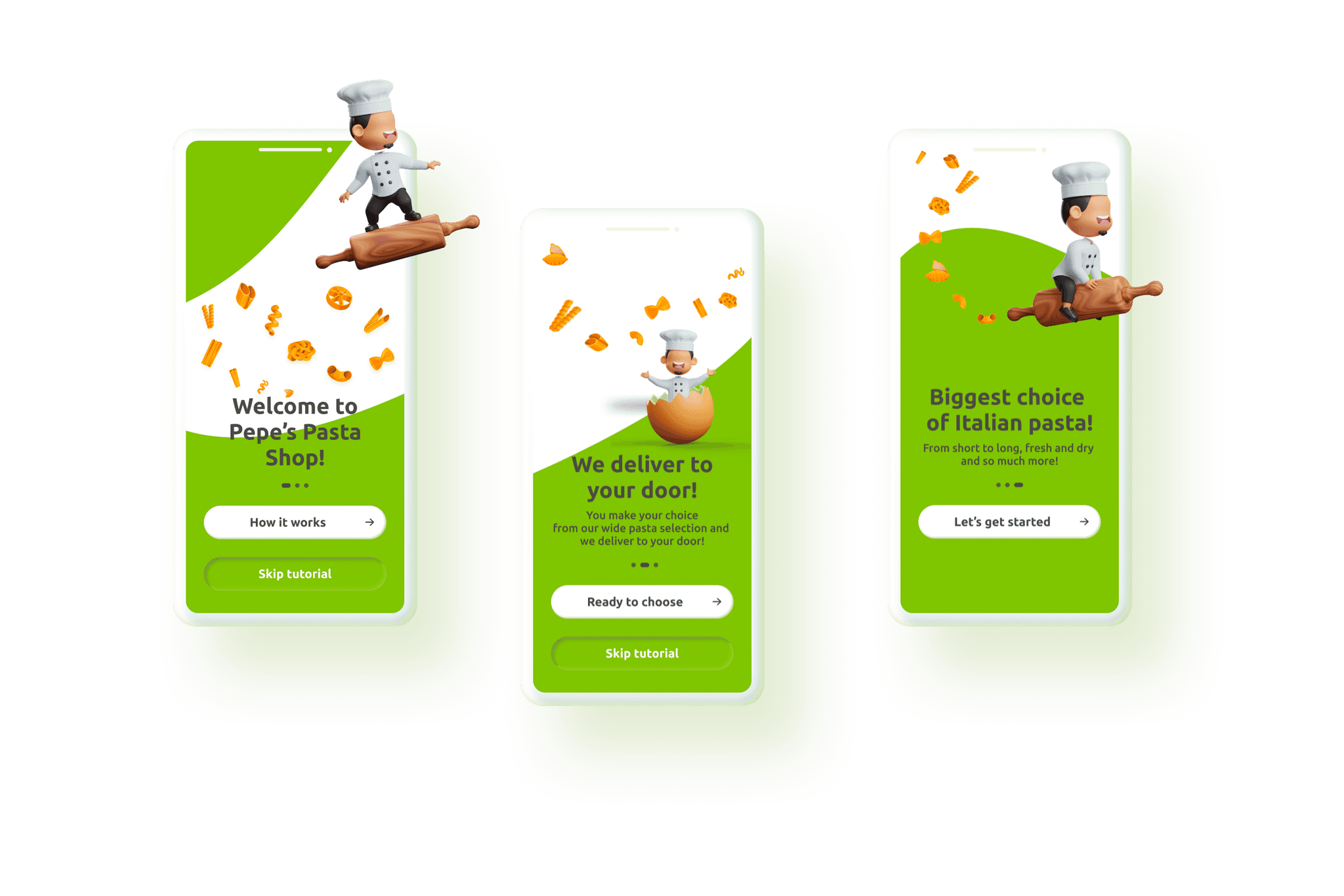
Pepe’s Pasta Shop
Biggest choice of Italian pasta delivered to your door.
Project background
Where
Milan, Italy
Role
Designer, Researcher
What
Native Mobile App
Category
E-commerce, food
Why
Portfolio Project
When
Jan 2024-Mar 2024

Market Research
The claim
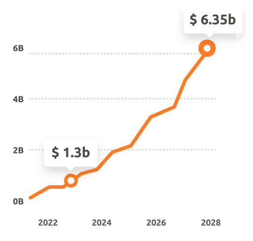
Italy is one of the countries showing a greater propensity to purchase grocery goods online. In 2023 the market recorded a jump of 7% against 2022 reaching a value exceeding $1.3b.
The Italian pasta market is projected to grow by 3.52% (2024-2028) resulting in a value of $6.35 b in 2028.
The problem
The rise in hectic lifestyle is causing a surge in demand for ready-to-cook food products with a strong accent on the quality.
Competitive analysis
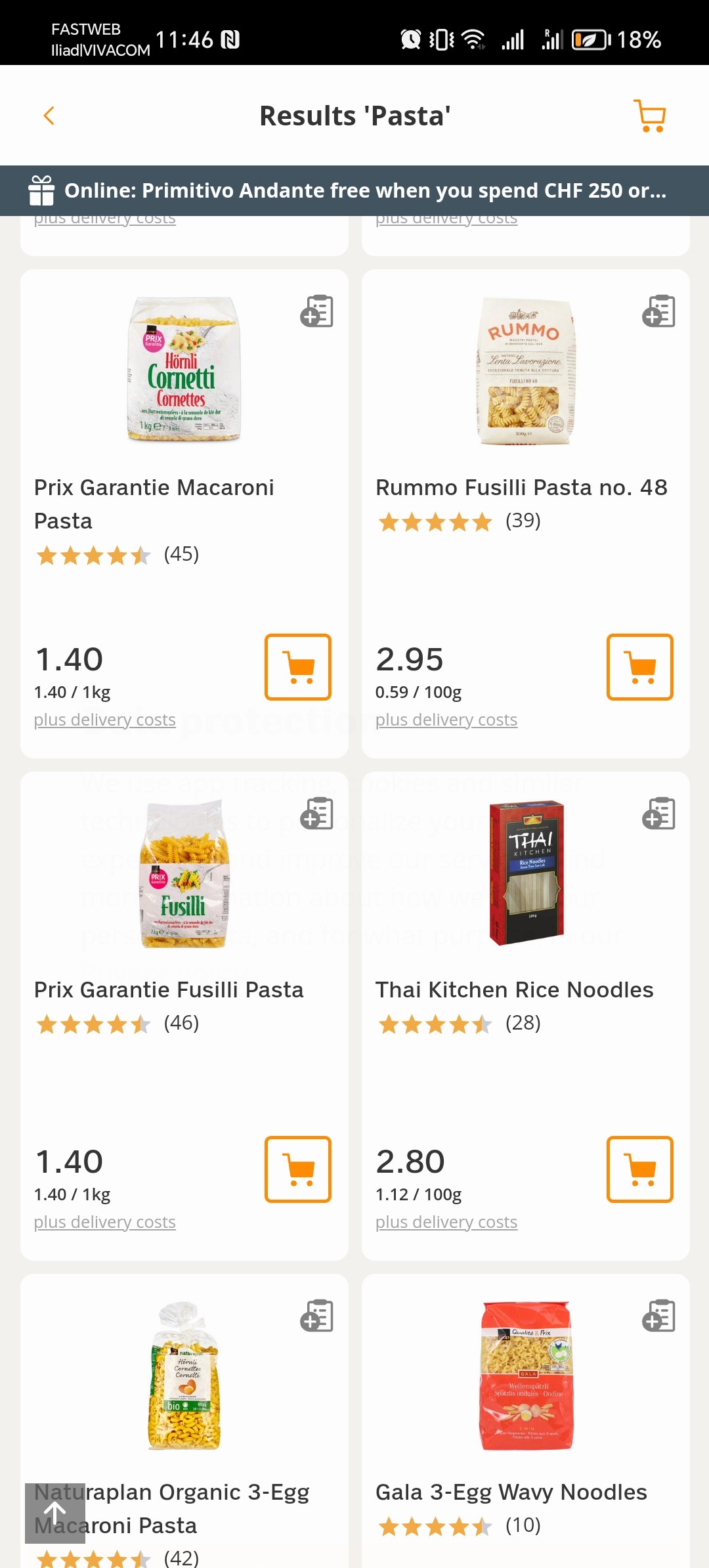
I analyzed 3 of the most popular in Italy apps for online grocery shopping.
Looking both at the ordering experience and negative comments on the Play and App stores, as well as in the popular Trust pilot website. By doing this I found patterns and established user pain points.
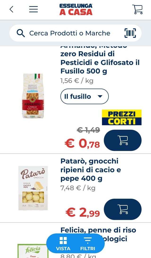
Essenlunga
COOP
Conad
The good experience
🟢Ability to book a delivery slot with date and time. (Essenlunga)
🟢Possibility to pick up the goods on site. (COOP)
The bad experience
🔴Missing items from the order due to unavailability in store (warehouse). The customer is not notified ahead and is being charged, which leads to customer service involvement. (all apps)
💡Solution
This can be resolved by informing the customer upfront of product unavailability and the option to be notified when the product is available.
🔴Ordering experience is not user-friendly and users are confused about the features, menus and buttons on the app. (COOP)
💡Solution
Simplifying the user journey and the whole process of placing an order. Creating mini-engaging tutorials for a better understanding of the features and for them to be valuable for the customers.
User surveys
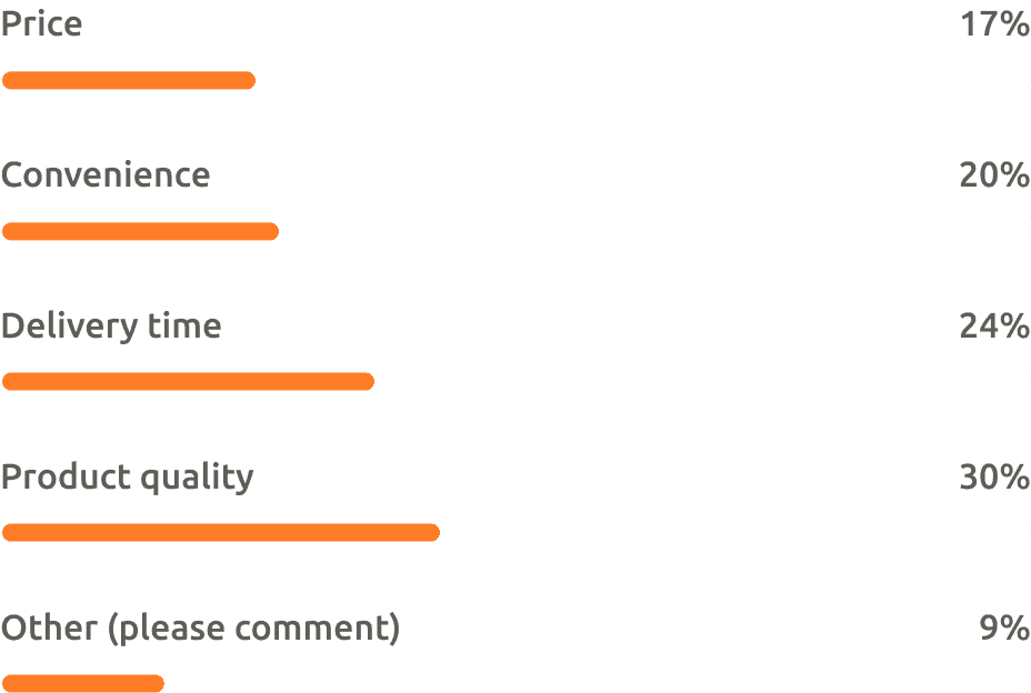
I conducted a survey on LinkedIn among people, who get their groceries delivered home once weekly.
💸What’s the most important factor you take into account while ordering groceries online?
18 participants
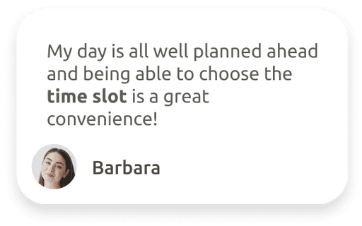
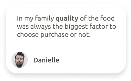
Notable comments
In my research, I used also a survey conducted in September 2023 by YouGov Italy, which states that Italians eat about 23kg of pasta in a year. Details of the results can be seen below.
1057 participants
🍝On average, how often do you eat pasta?
2-3 days a week, 37%
4-5 days a week, 30%
6-7 days a week, 17%
1 day a week, 8%
Other, 9%
Research results and findings
There is and will be in the future a growing need for convenient, easy-to-use service with high-quality products, with fast and satisfying delivery. More than ever online grocery shopping is seen as a solution for busy everyday lifestyles.

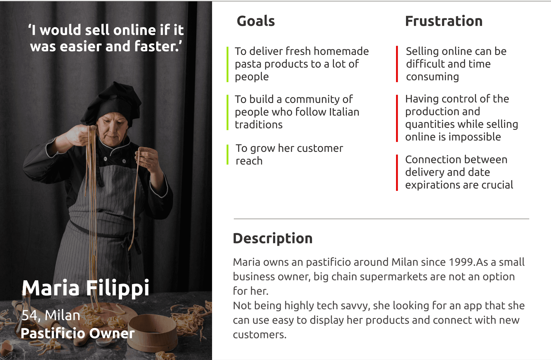
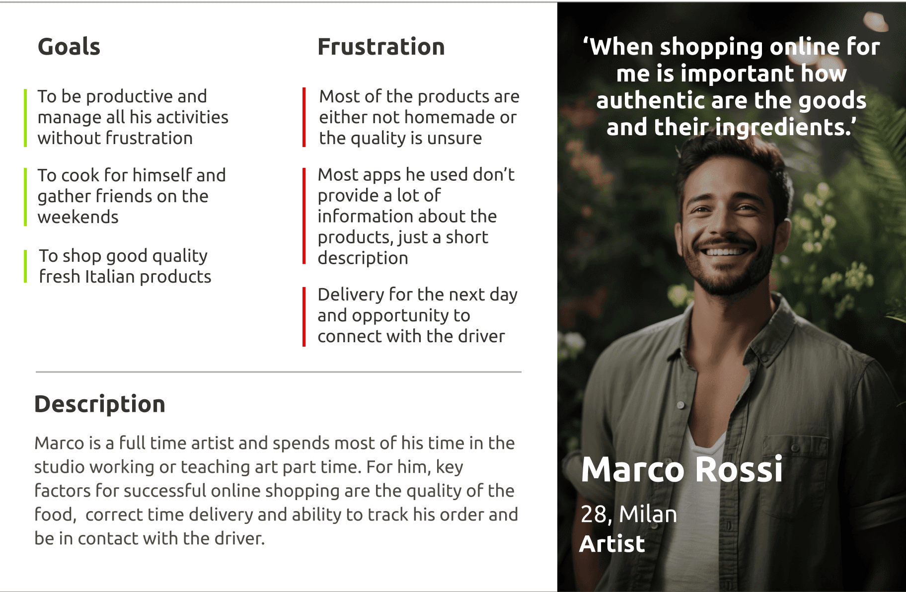
Personas

Time to start designing!
Once I went through all my research data, it was time to sketch, and put together the first flows and the initial low-fidelity wireframes.
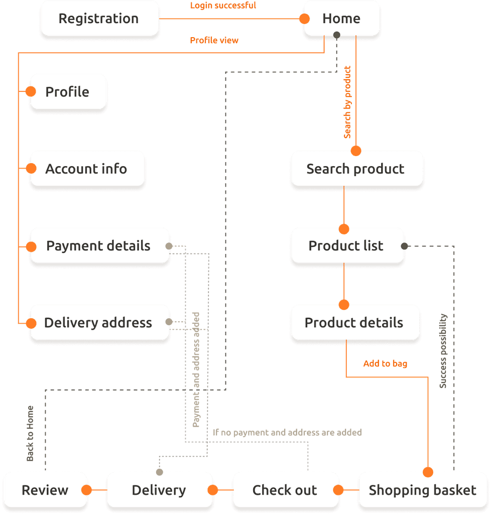
Flow Diagram
To outline all necessary functionalities I created a simple flow diagram of the main tasks the user can do. One of the flows is shown below.
Main Client flow
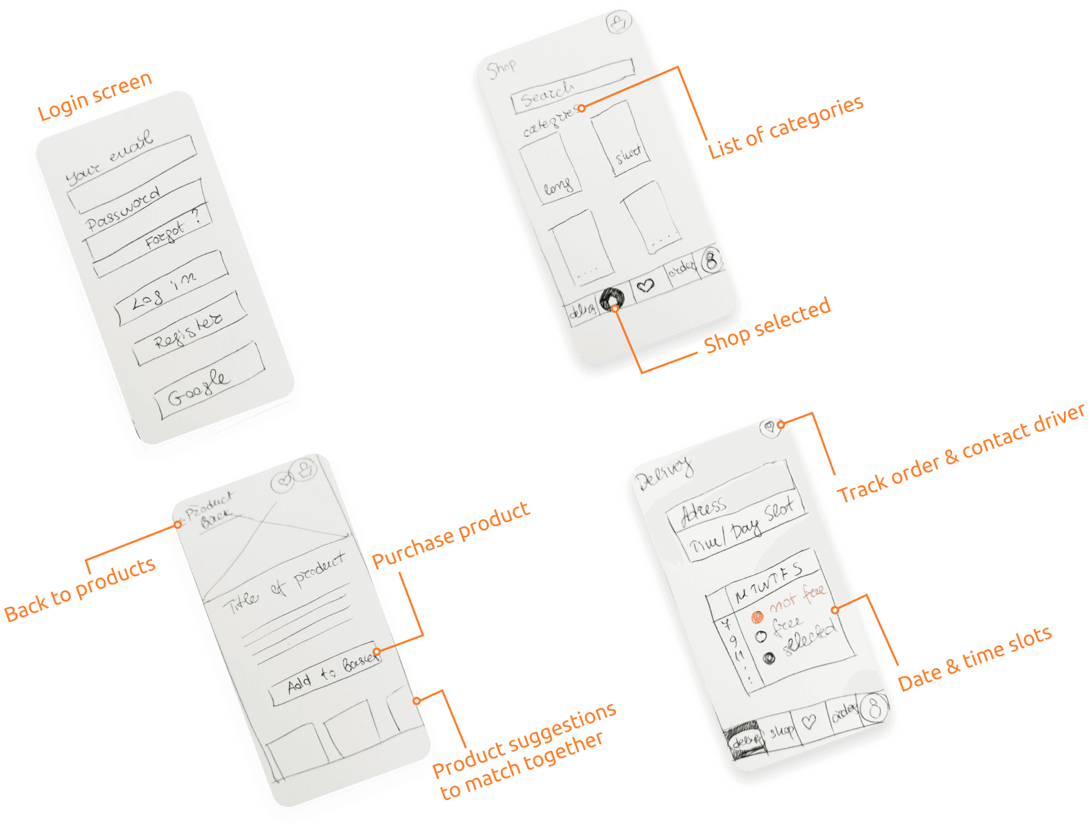
Low- fidelity wireframes
When the flow diagram was established, I started creating the low- fidelity wireframes of the main flows.
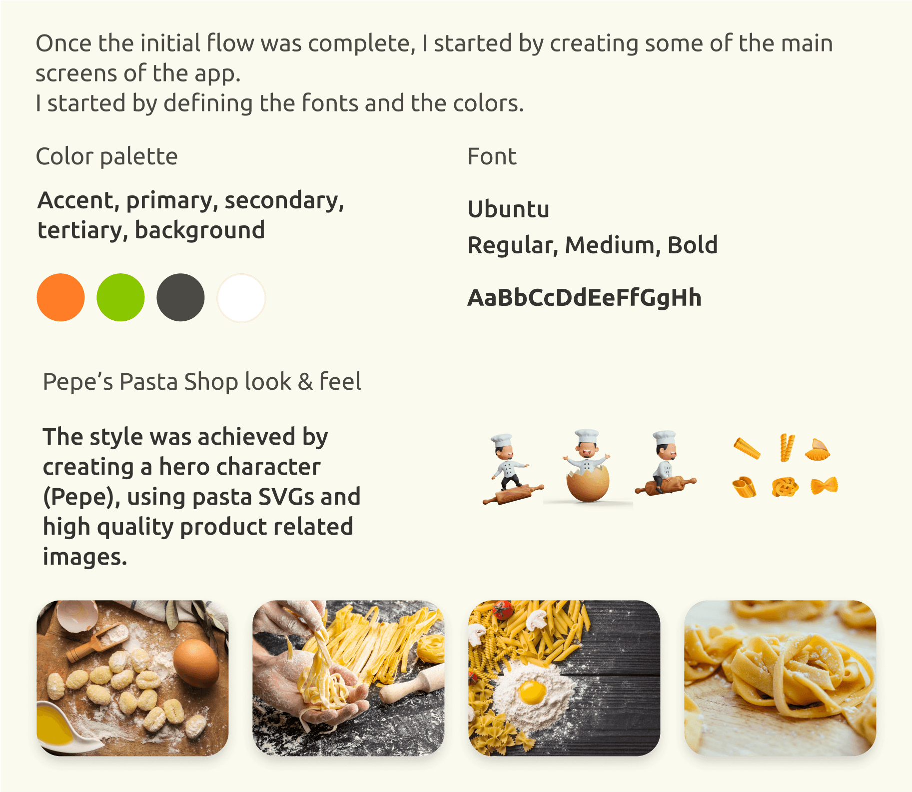
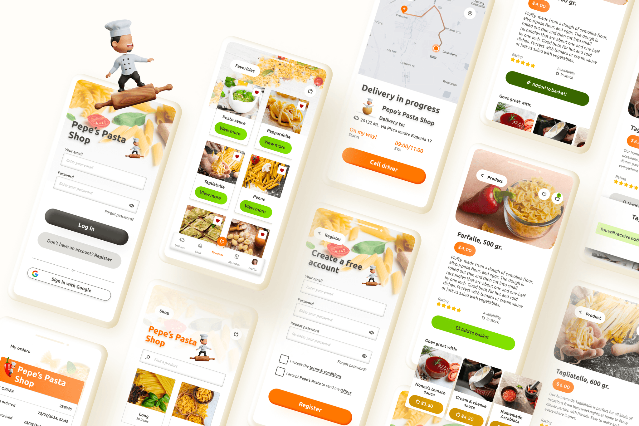
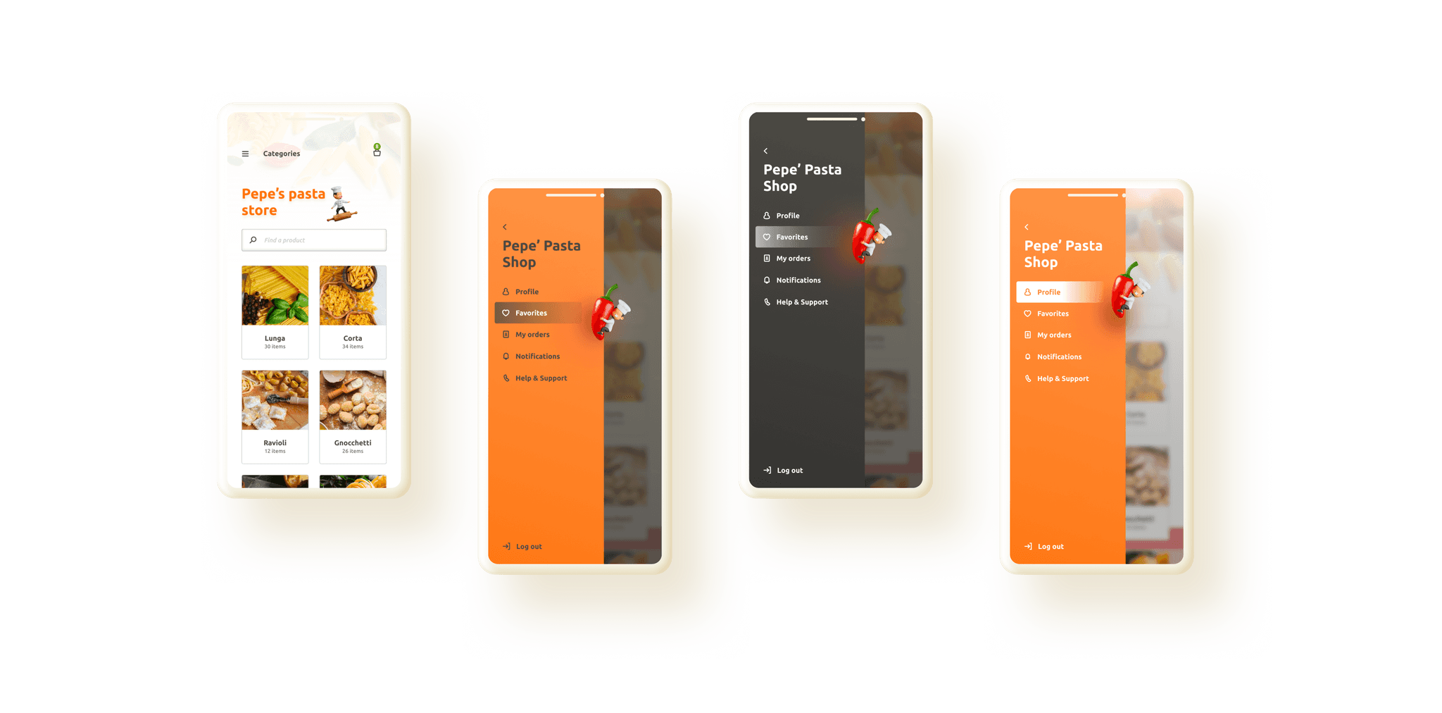
High- fidelity UI Design
30 high-fidelity designs were created
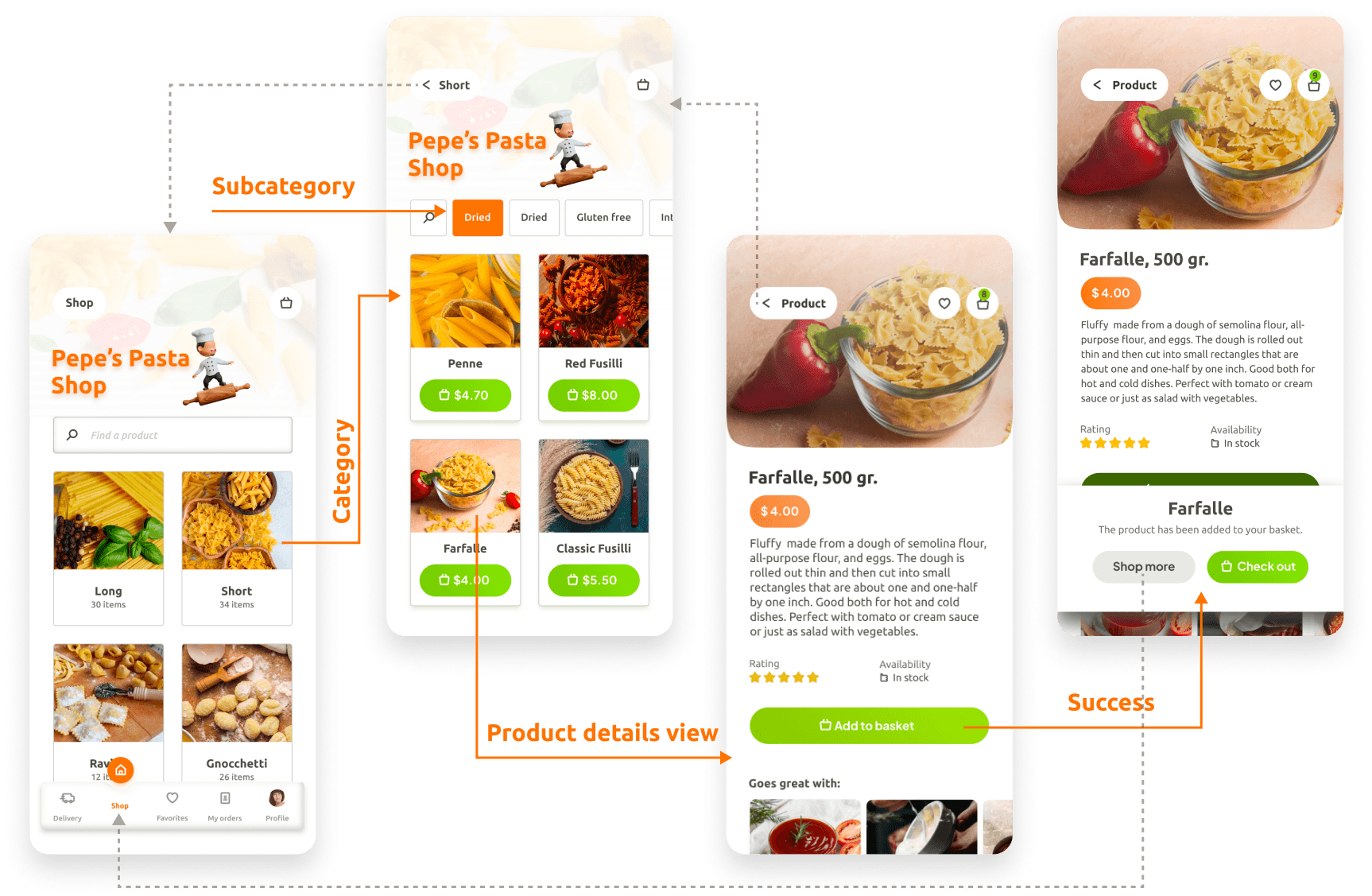
Including two different navigation patterns (tab bar and a hamburger menu) that could be used for A/B testing in further design stages.
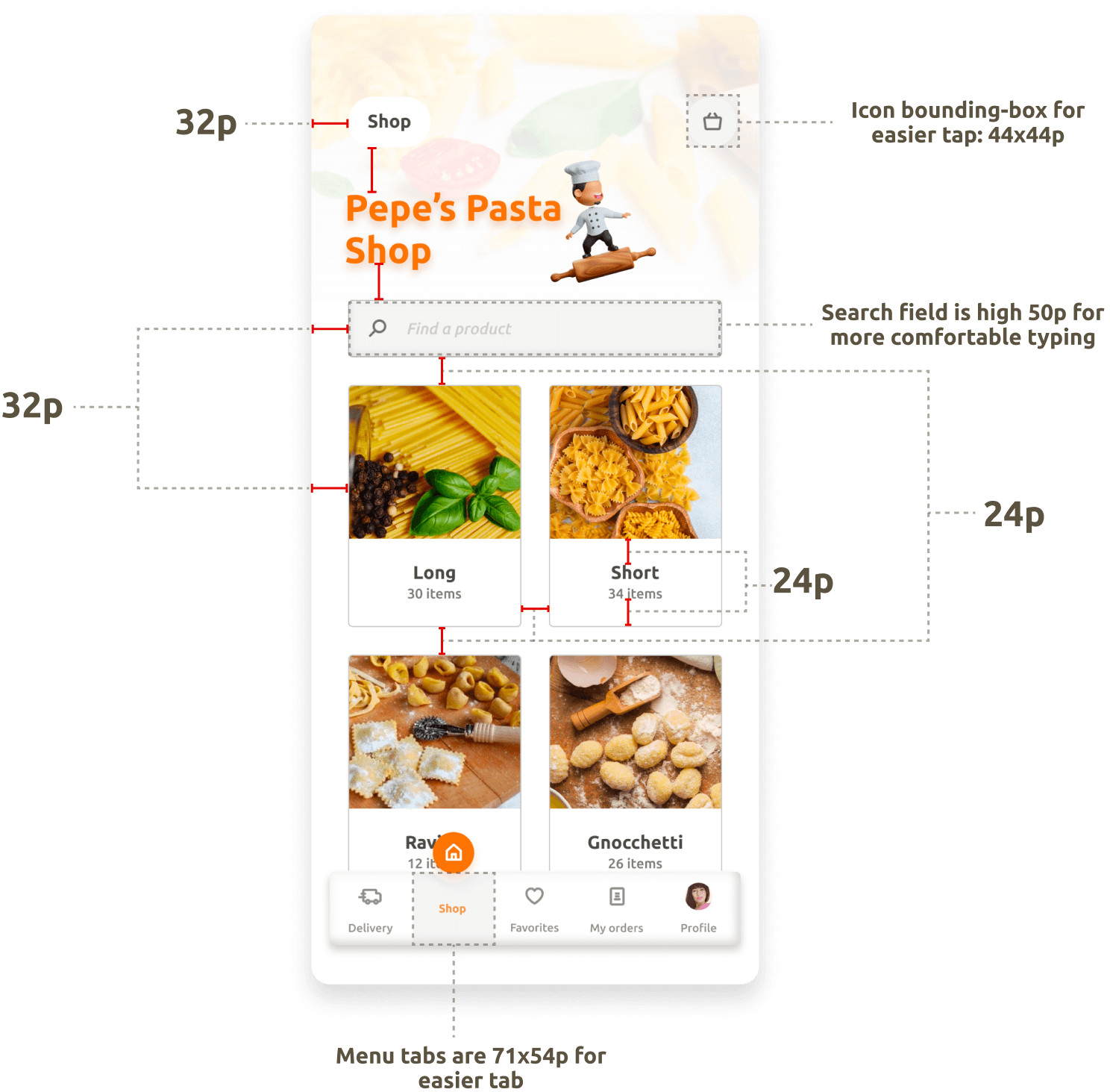
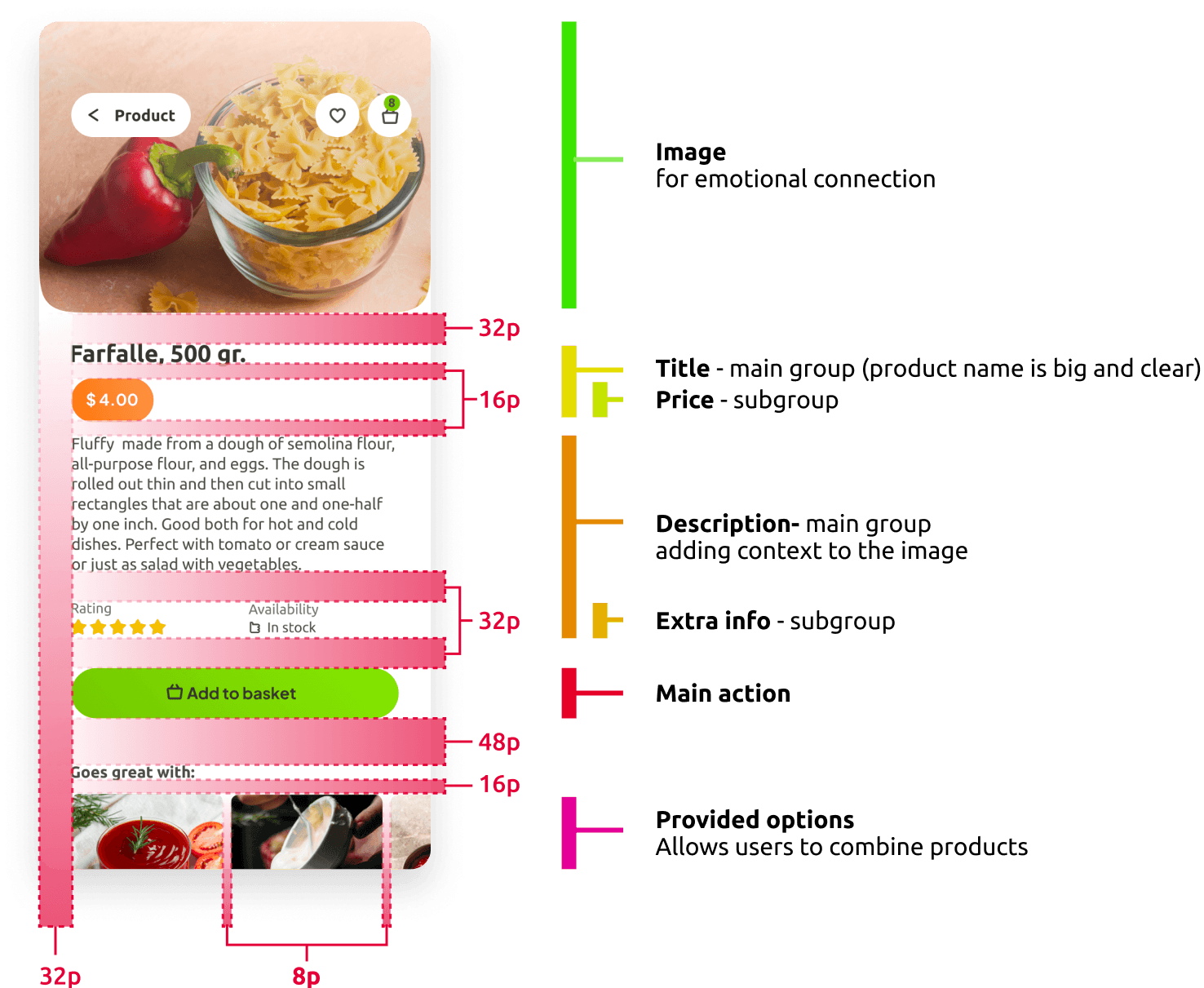
Alignment and grid
I picked an 8- point grid for the project and set the margins within the groups at 8 and 16, with margins between the groups at 24, 32 and 48.
Usability study
I connected my high-fidelity designs into a clickable prototype. The prototype allowed me to test the app with a group of users.
Prototype validation
I tested the prototype with 3 users. Each was given a subset of the prototype dedicated to the category, subcategory, product and product details views. I wanted to be sure users understand that there are more products with categories and subcategories, also each product has a dedicated page.
This was tested over a Zoom call, where I introduced the user to the app and asked them questions to find out if finding the category and the product tabs was easy and accessible.
The goal of the Usability study was to see how many of the users would successfully complete the flow and what difficulties they might face.
Study results
Two out of three users were unsure where to click to get to the product details from the category page. With adding products to the basket they didn’t have issues but didn’t understand that they could see the details of the product by tapping on the product image.
This means that only one person achieved success in completing the flow.
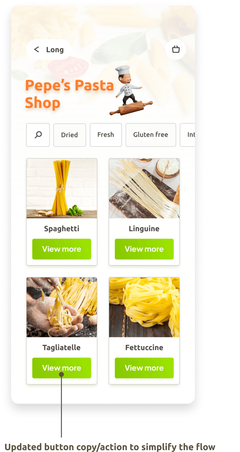
Prototype update concept
Because of time constraints I was not able to run a second usability study on the updated prototype. However, I have taken into account the insights of the conducted usability study and updated the app moving the add to shopping basket button to the detail page and replacing it with ‘view more’ on the category page.
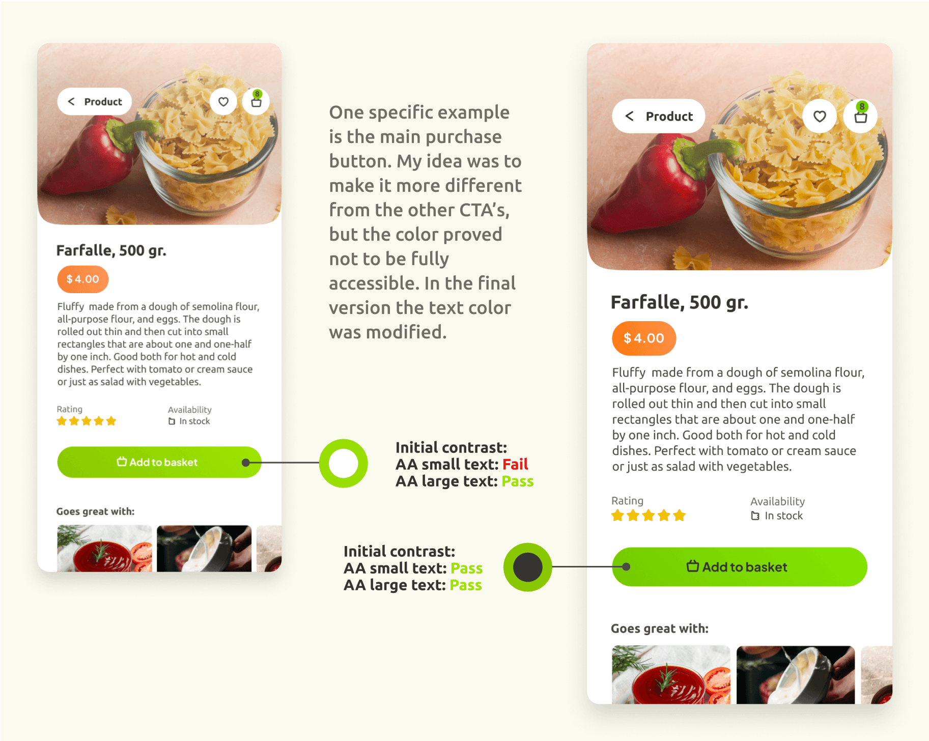
Accessibility check
The app has been evaluated for contrast to match the AA standards of WCAG. In some, cases I found that the contrast can be improved.
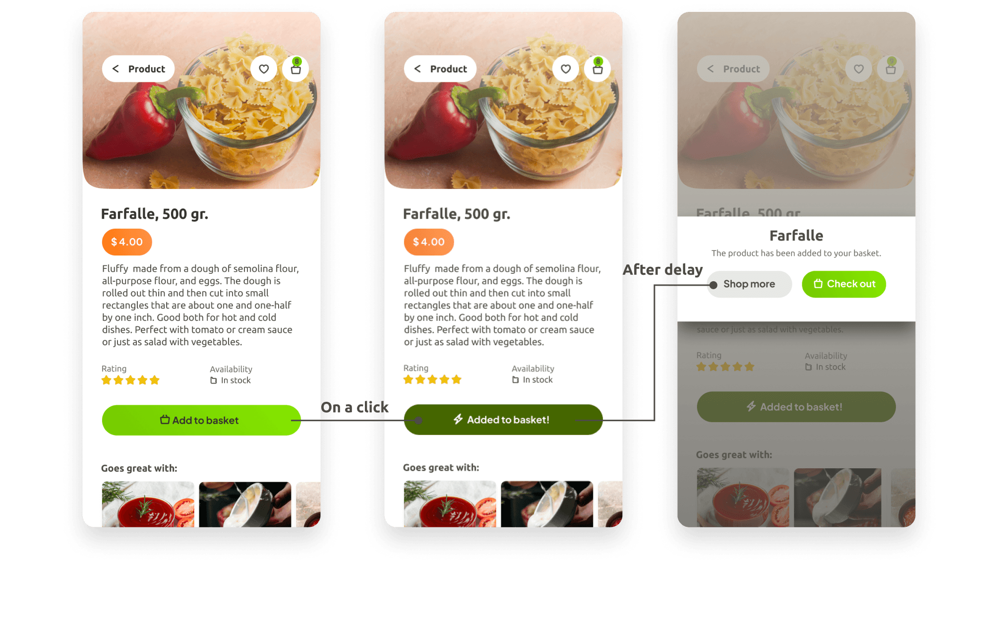
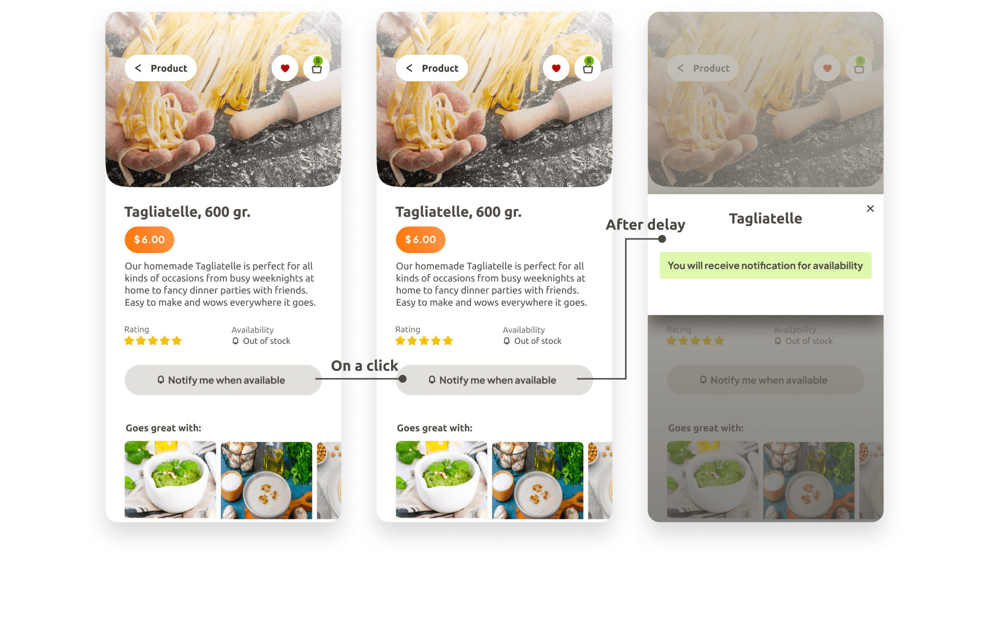
Pop-ups and overlays
Pop-ups and overlays were added to improve the dialog between the user and the app by adding additional information about the result of a specific action. This will have a positive effect on the user’s experience. The examples below show the order of appearance of the screens.
Add to basket action
Notify when available action
Complex component breakdown
Dividing the card into logical groups using Hierarchy Strips and defining the spacings within the groups.

Project summary
During the Research phase of the project, I did a market evaluation, conducted a survey and Competitive analysis of the three major competitive apps.
Using the data that I gathered, I started ideating by creating user personas, user flows and low-fidelity wireframes. The next logical step was putting them together in a prototype and testing it with users.
After all these steps I started building a high-fidelity beautiful UI design. In the last check up round, I did an audit focusing on consistency and color contrast with regard to accessibility.